September 22nd, 2014
The iSEEK team is happy to announce recent enhancements based on user feedback. This release we focused on enhancing visual functionality and performance, along with a few other improvements. We think you’ll love how easy it now is to:
- Select and customize your own color themes
- Filter and Associate multiple tables and charts with one another
- Highlight key results in your tables
- Customize your own Avatar
Highlights of new iSEEK release
Thank you for your feedback!
 Over 6 stories completed

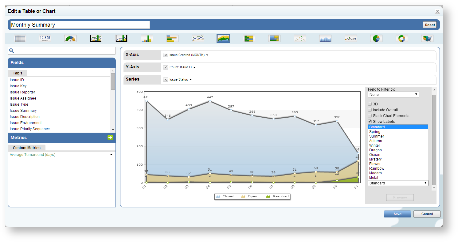
Select Your Own Chart Themes
Users can now select their own color themes when creating new charts. This menu can be accessed on the bottom left of the visualizer.
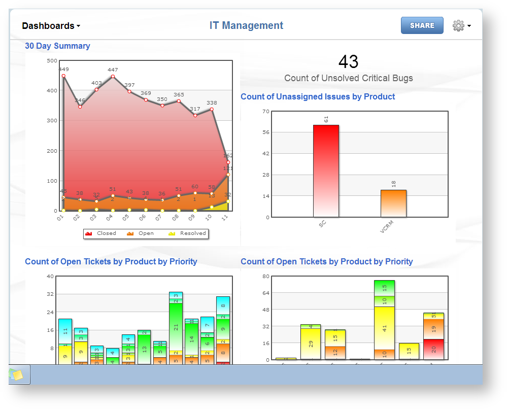
Users may also change their entire chart theme for dashboard. Simply click the sprocket and access the color pallete menu to select from a variety of pre-populated themes
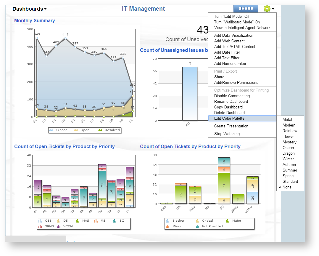
For example I will select the "Rainbow" color theme.

New Dashboard Chart Associations
As part of a dashboard a user may choose to use a specific chart as an in place "filter", allowing users to toggle selections and change the results of other charts within the dashboard
- Click the down arrow on the chart you would like to make a "filter"
- Access the menu called "Change Interaction Mode", and select "Filter Current Dashboard"
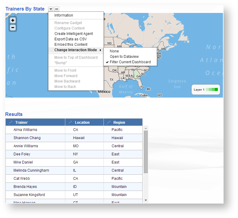
Once selected, the user can now click an element on the above map to filter the results of other tables and charts. For example I will select California on the above map
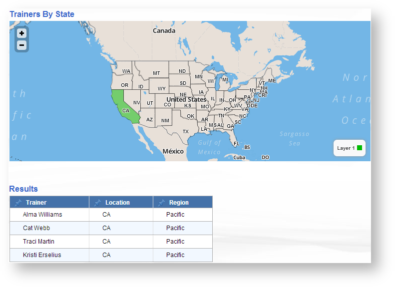
As we can see the below table is only showing data associated to California. The user can then click the element again to toggle back to a full view.

Customize Your Personal Avatar
The user interface has been made easier to make it easier to customize your personal Avatar.
- Simply access your User Profile from the default Avatar on the top right.
- Select "Change Avatar and use the drag and drop interface or browse for a new Avatar Image.
![]()
Crop your Avatar image to the desired size and Apply the changes.

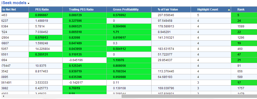
Highlight Key Results In Your Tables
User can now select a range of values to be highlighted in their table results. Once the table has been constructed simple access the small color wheel icon next to the numeric field of your choice.
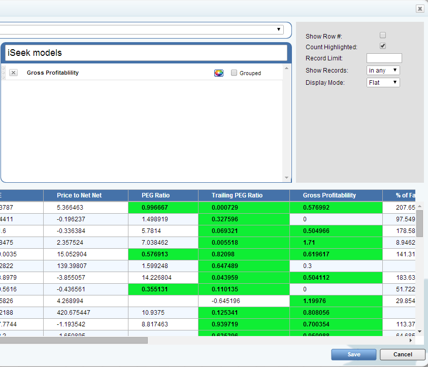
I will select my Gross Profitability field. Once selected there are several options that can be selected
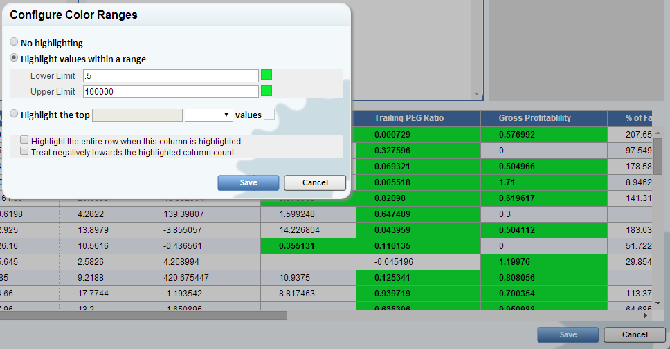
- No Highlighting: This will keep the column as normal with no changes
- Highlight values within a range: Select a range where you would like to see the columns highlighted. Select two colors for a gradient effect or the same color to make the fields more noticeable.
- Highlight the top (or bottom) # of records: Highlights the top or bottom number of records specified.
- Highlight entire column: This selection allows users to highlight the entire row of data to view all associated data.
- Treat highlighted column as a negative: When using the highlighted count, we can see the number of columns highlighted per row and apply a negative value to the selected column. (see highlighted count below)

Highlighted Column Count
Allows users to create a column that counts the number of columns highlighted by row.

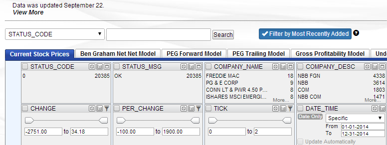
Most Recently Added Data Filter
For users with an incremental datafeed we have implemented a new filter for Most Recently added data. This option controls whether the current dataview includes all records or only the records added in the most recent datafeed. By default all records are shown.