November 5th, 2014
The iSEEK team is happy to announce recent enhancements based on user feedback. We think you’ll love how easy it now is to:
- Create Mash-ups of your data
- Enhance your results views with embedded charts
- Resize your data columns for readability
- Customize your own chart themes.
Highlights of new iSEEK release
Thank you for your feedback!
 Over 5 feature and improvement requests fulfilled

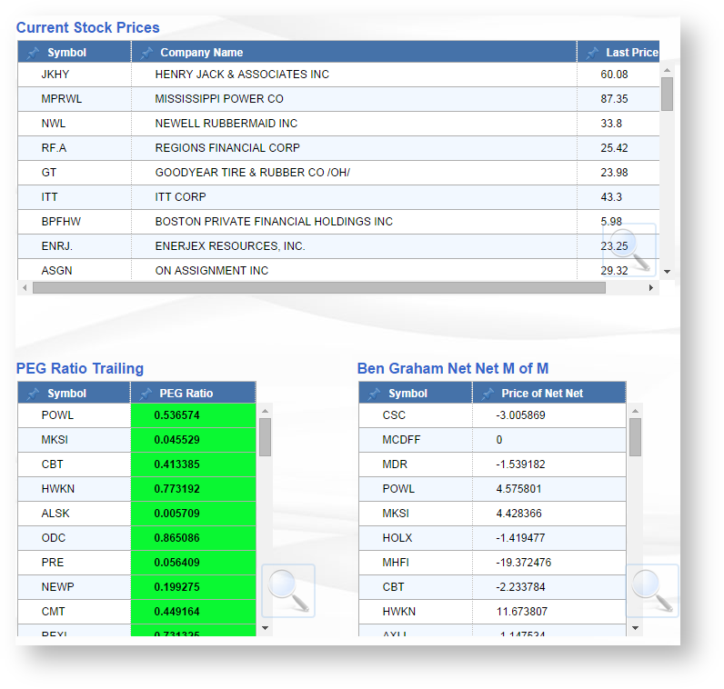
Creating Mash-up Views
Create multiple results views from any of your dataviews that share an identical field/value and add them to a dashboard.
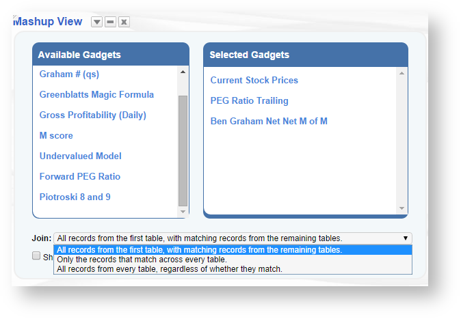
 On the dashboard select the "Add Mash-up" option from the sprocket menu. Select which results view you would like to join, and how they should be joined:
- All records from first table with matching records
-Only records that match across all tables
-All records across all tables even if they dont match
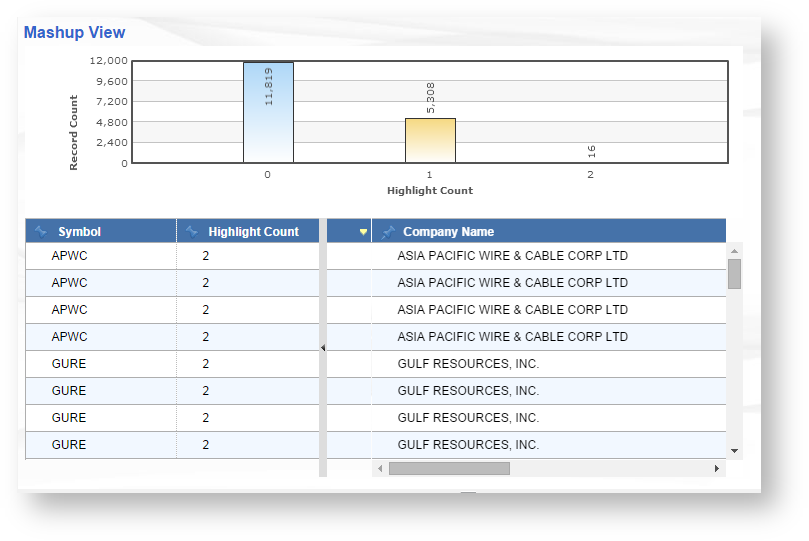
 Users are now able to view your mash-up **histogram will appear if you included highlighted columns

Embed Charts Into Results Views
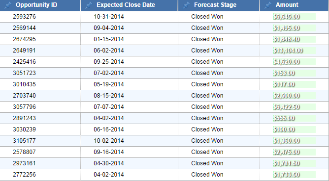
Users may now enhance they numeric fields in a results view by selecting the 'Graph it" icon.
Once the icon is selected, the user may select colors for positive and negative values.
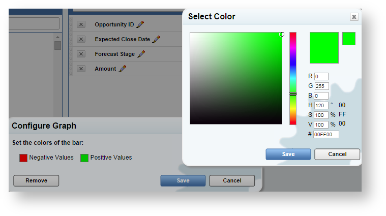
Once the user clicks save, we can see the bar appear under the column header. Ranges are determined by the share of the total amount.

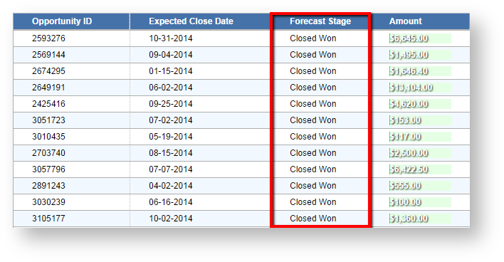
Resize Column Width
Users my now resize the with of the columns in all tables. Here we can see the column is too large and we can not see all of our data:
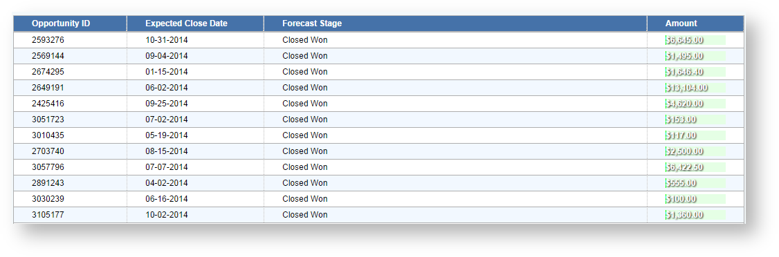
By resizing our column we can now shrink the overall size of our table to easier readability.

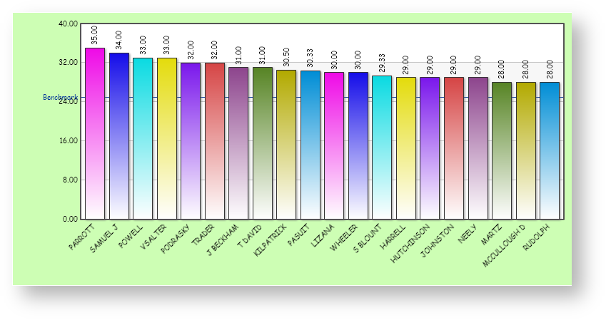
Customize Chart Themes
Users are now able to change and customize their chart themes. There is preset list to choose from as well as the option to add a custom theme:
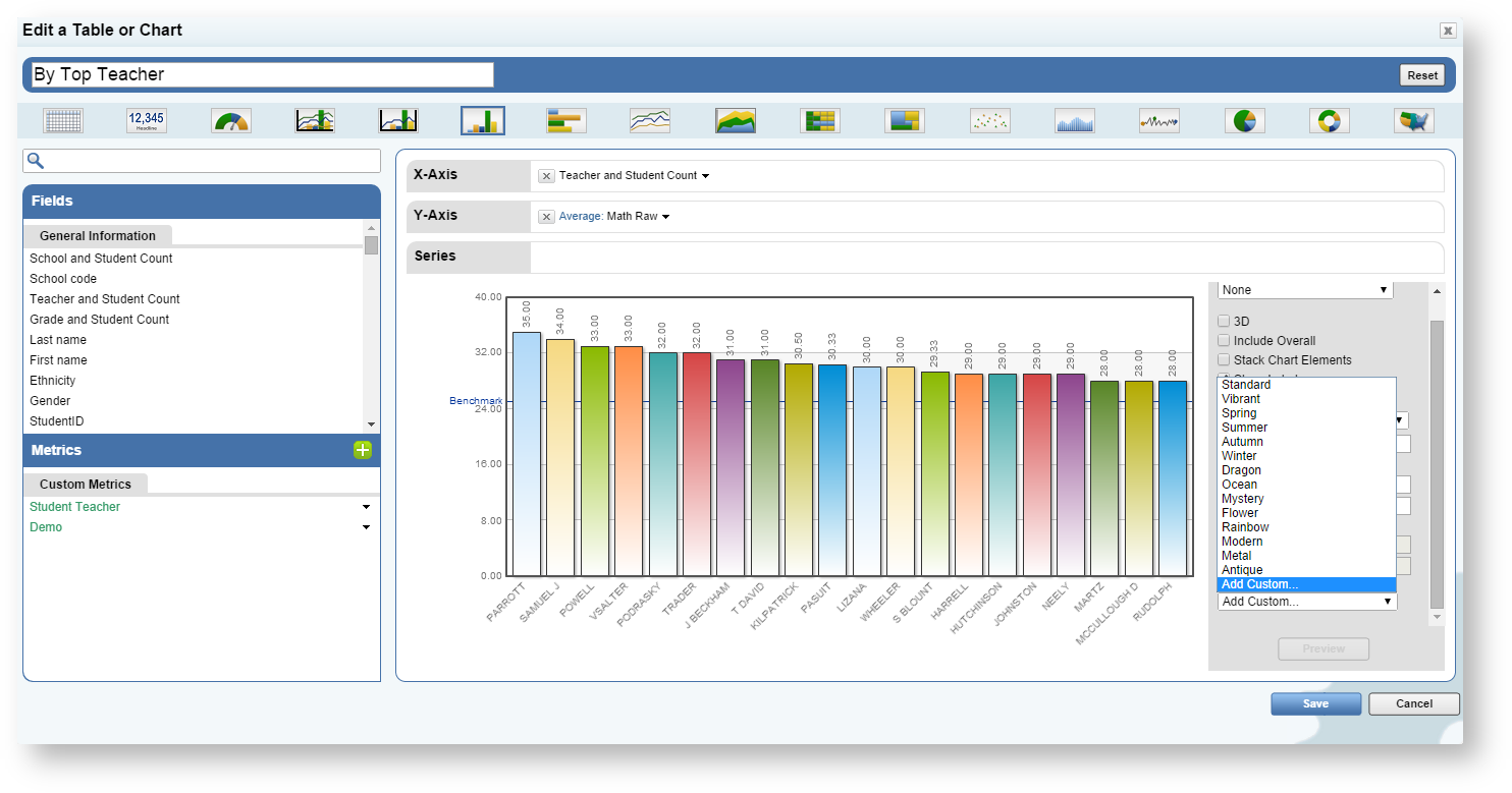
If the "Add Custom" option is selected, the user may now change the order or specific colors, the color and style of the font used, as well as the color of the chart background
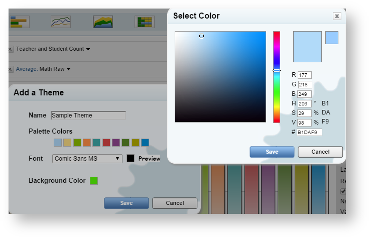
The user can save an unlimited number of custom themes and preview the changes before saving

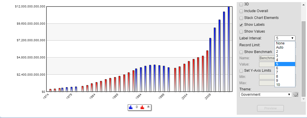
Label Intervals On The X-Axis
Users can now change number of labels displayed on the x-axis. Here is an example of the total debt held by the american public since the early 1900's.
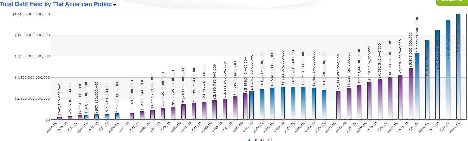
As we can see there are many labels on the x-axis that make it difficult to read. What if I just wanted to see the year in intervals of 5? Simply select the "Label Interval" option when creating a chart and select your desired number of intervals.